


Chinese Calligraphy has been evolving continuosly over the past thousands of years and has been an indispensable part of Chinese civilization. It is not only a practical technique for writing Chinese characters, but also a unique art of expression. It is seen as a combination of the beauty of image in painting, the beauty of dynamism in dance and the beauty of rhythm in music. It is a gem in the world's art treasury.
With its long history of development, Chinese Calligraphy has evolved into a variety of styles. In general, these numerous styles can be broadly grouped into five categories, namely ZhuanShu, LiShu, KaiShu, XingShu, and CaoShu. Each script has its unique features and thus its unique charm and beauty.
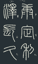
 Zhuan
Shu
Zhuan Shu shows its serenity through its well-balanced composition. It is characteriszed by strokes that are either smoothly curved or remarkably straight. Horizontal strokes are always notably horizontal and straight. Vertical strokes are also made as vertical and straight as possible. All the strokes are of even thickness and have round ends, with no pointed heads and tails. All the lines and curves are evenly and carefully arranged. You will not see the least bit of wildness in Zhuan Shu.
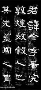
 Li Shu
Developed from Zhuan Shu, Li Shu retains quite some of the serenity of Zhuan Shu and introduces its own flexibilty, though limited. characters are squared in shape. While the strokes have no tilting at all like Zhuan Zhu, they change smoothly in thickness from the start of a stroke to its end. Horizontal and vertical strokes are no longer as straight as in Zhuan Shu. They are somewhat wave-like. One key stroke is featured by a slightly enlarged round head and a pointed tail. Angular turns in strokes can be frequently observed while smooth curves are seldom seen. Li Shu is a fine blend of serenity and flexibility.
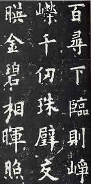
 Kai Shu
Kai Shu is a direct evolution from Li Shu and is well-known for its regularity and compactness. While Li Shu exhibits immense uniformity, Kai Shu brings about variations to its strokes and overall structure without losing its regularity. Horizontal and vertical strokes are made slightly tilt and slanted. The eight basic strokes, namely Dian(dot), Heng(dash), Shu(vertical downstroke), Pie(downstroke curving to the left with pointed tail), Na(slanted downstroke curving to the right with pointed tail), Ti(slanted upstroke to the right with pointed tail), Zhe(bend) and Gou(hook), become much more prominent. By further tuning these eight basic strokes and the overall configuration of strokes, many different sub-styles of Kai Shu have arisen.
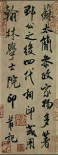
 Xing Shu
Xing Shu acquires a more flexibile and smoother flow of strokes at the expense of regularity of Kai Shu, from which it originated. While strokes in Kai Shu are strictly discrete, some adjacent strokes in Xing Shu are actually joined or combined in a natural manner to benefit swiftness in writing. The flow of strokes thus becomes more vivid and flexible. Since substantial flexibility is allowed in Xing Shu, the possibilities of writing a character in Xing Shu can be numerous, giving rise to the large number of different sub-styles in Xing Shu. Despite that, integrity is never sacrificed. Xing Shu is currently the most popular writing script among others for its speed of writing and recognizability.
 Cao Shu
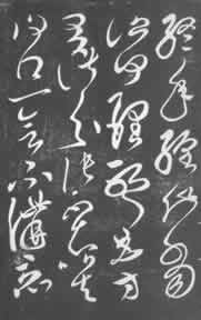
Cao Shu is a very distinguishable style of writing in Chinese Calligraphy. It is like a dance of lines and curves on paper with unparalleled grace and fluency. It becomes hard to identify a discrete stroke or sometimes even a discrete character in Cao Shu. One stroke always follows immediately from another without a clear break. To many people including Chinese, Cao Shu is hardly recognizable. Indeed, Cao Shu is developed from the shorthand writing of Chinese. Thus, characters in Cao Shu are highly abbreviated. Strokes in a character are combined, repositioned or even left out. Little resemblance is left between the regular version and the Cao version. Anyway, it is art!
| Styles | Works | Games | Services | Contact us |